Choosing the right colours for a child’s room is far more than a design decision, it is a developmental one. The colours surrounding your child during their formative years influence how they think, feel, play, and learn. Research in environmental psychology confirms that colour affects children’s mood, concentration, creativity, and even sleep quality.
Whether you are decorating a nursery, a toddler’s room, or a space for a school-age child, this guide covers science-backed, practical, and visually beautiful colour combinations that spark imagination and support healthy development.
Why Colour Matters in a Child’s Room
Children spend a significant part of their day in their bedrooms, sleeping, playing, reading, and daydreaming. Studies in chromotherapy and environmental design show:
- Yellow stimulates the intellect and encourages communication.
- Blue lowers heart rate and promotes calm focus, ideal for reading nooks.
- Green, associated with nature, reduces anxiety and supports concentration.
- Red increases energy and excitement, best used sparingly as an accent.
- Orange encourages enthusiasm and social interaction.
- Lavender and soft purples support creativity and emotional balance.
Get discovered by the right audience with Top Interior India. Feature your projects, stay updated with the latest design trends, and enhance your presence on one of India’s leading platforms for interior designers and architects.
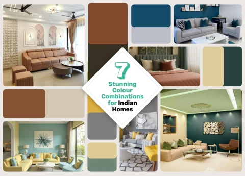
7 Best Children’s Room Colour Combinations for Creativity and Comfort
1. Sunshine Yellow + Crisp White
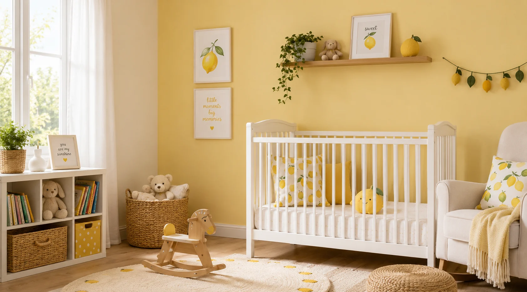
This classic combination is uplifting without being overwhelming. Soft buttery yellows paired with white trim create an airy, joyful space ideal for toddlers and young children.
- Best for: Nurseries, toddler rooms, playrooms
- Mood created: Happy, energetic, warm
- Designer tip: Use yellow on a single feature wall; keep the remaining three walls white to maintain brightness without sensory overload.
2. Sky Blue + Cloud White + Soft Grey
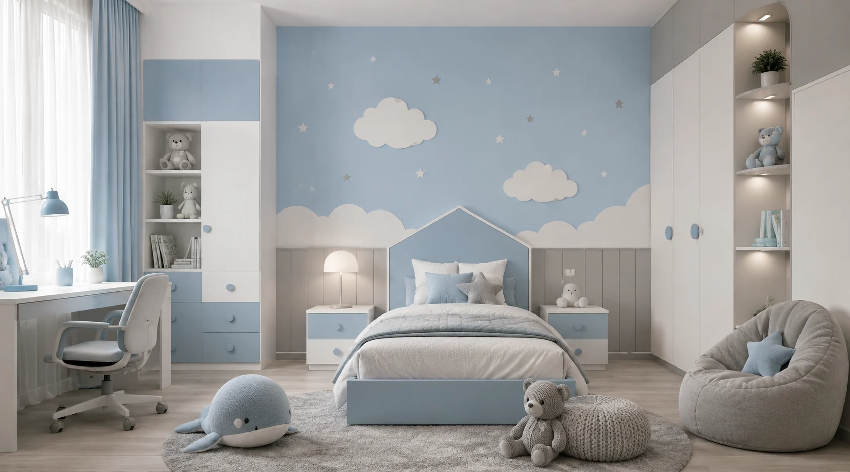
A timeless trio that works from infancy through teenage years. Sky blue is calming and gender-neutral, while grey adds sophistication, and white keeps the palette fresh.
- Best for: Boys’ rooms, shared sibling rooms, sleep-focused spaces
- Mood created: Peaceful, focused, serene
- Designer tip: Introduce texture through woven rugs and linen bedding in the same colour family to add depth without additional colour chaos.
3. Sage Green + Warm Cream + Natural Wood Tones
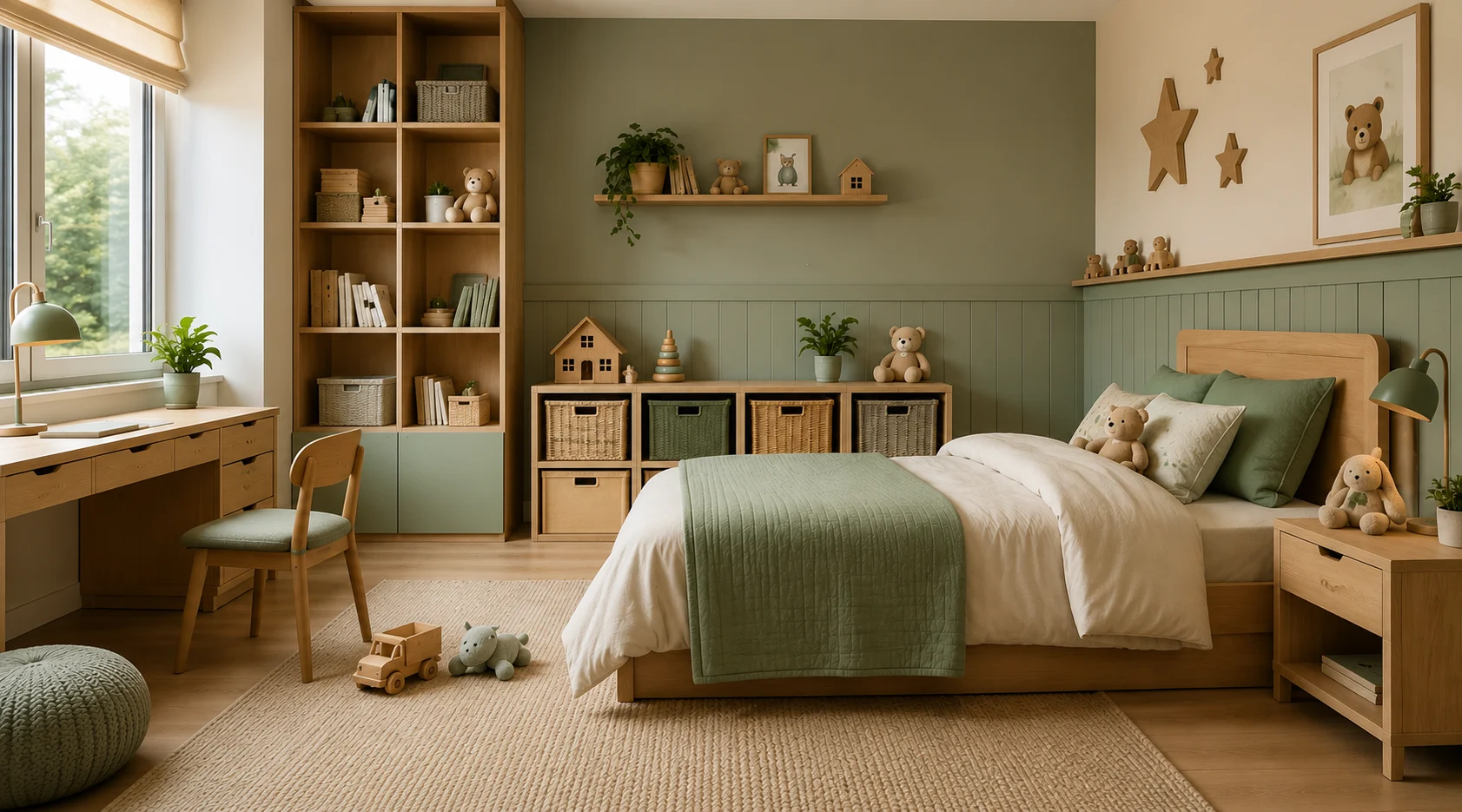
This nature-inspired combination is trending in 2025-2026 children’s interiors and for good reason. Sage green reduces overstimulation while cream and wood accents add warmth.
- Best for: School-age children, gender-neutral rooms, Montessori-inspired spaces
- Mood created: Grounded, calm, creative
- Designer tip: Layer indoor plants, wicker storage baskets, and botanical wall art to reinforce the nature theme.
4. Coral + Peach + Off-White
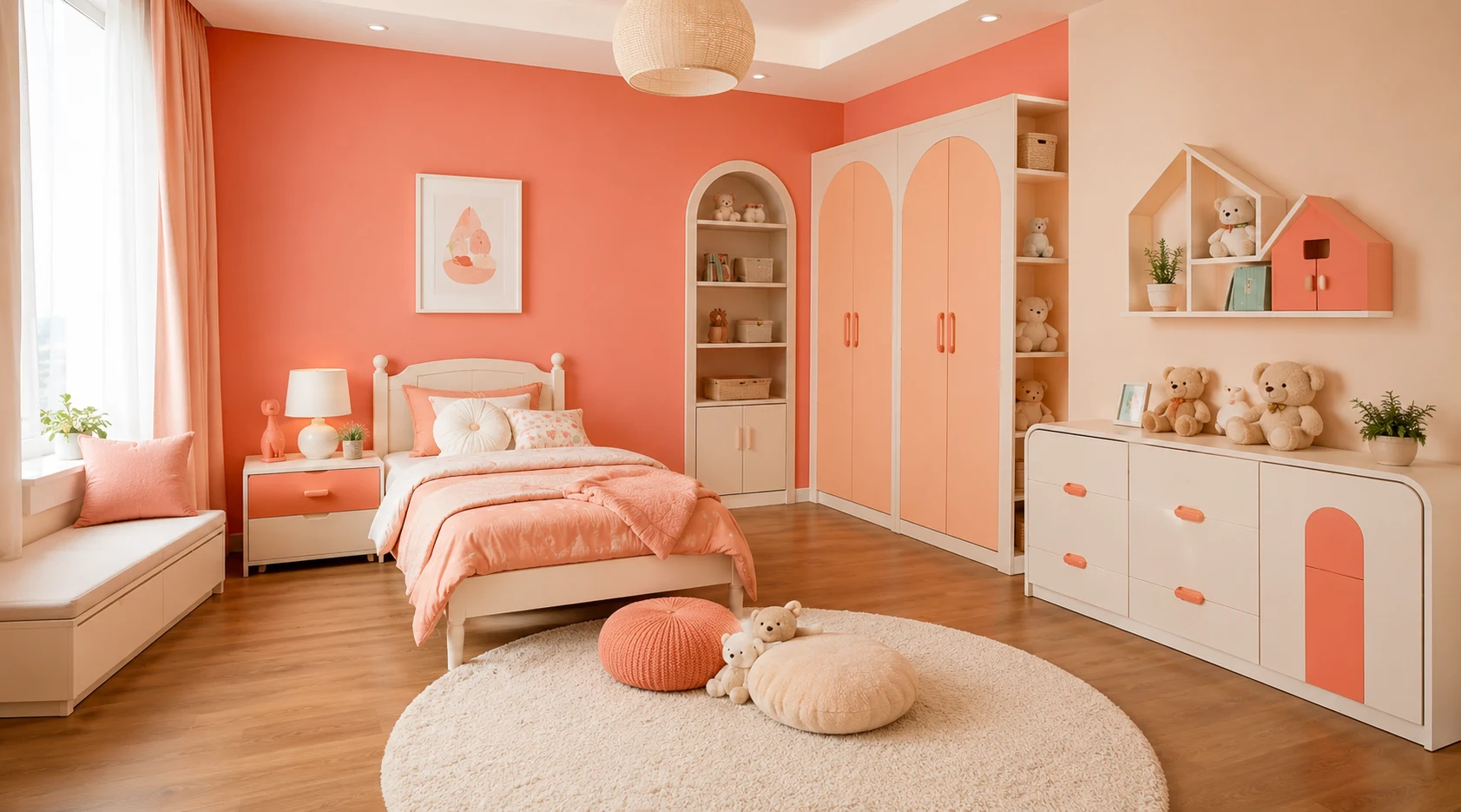
This warm, sun-kissed palette feels playful yet soothing. Coral energises without the intensity of red, while peach transitions beautifully from day to evening light.
- Best for: Girls’ rooms, creative kids, artistic children
- Mood created: Warm, imaginative, joyful
- Designer tip: Balance warm tones with plenty of white, use a 60% white, 30% peach, and 10% coral rule.
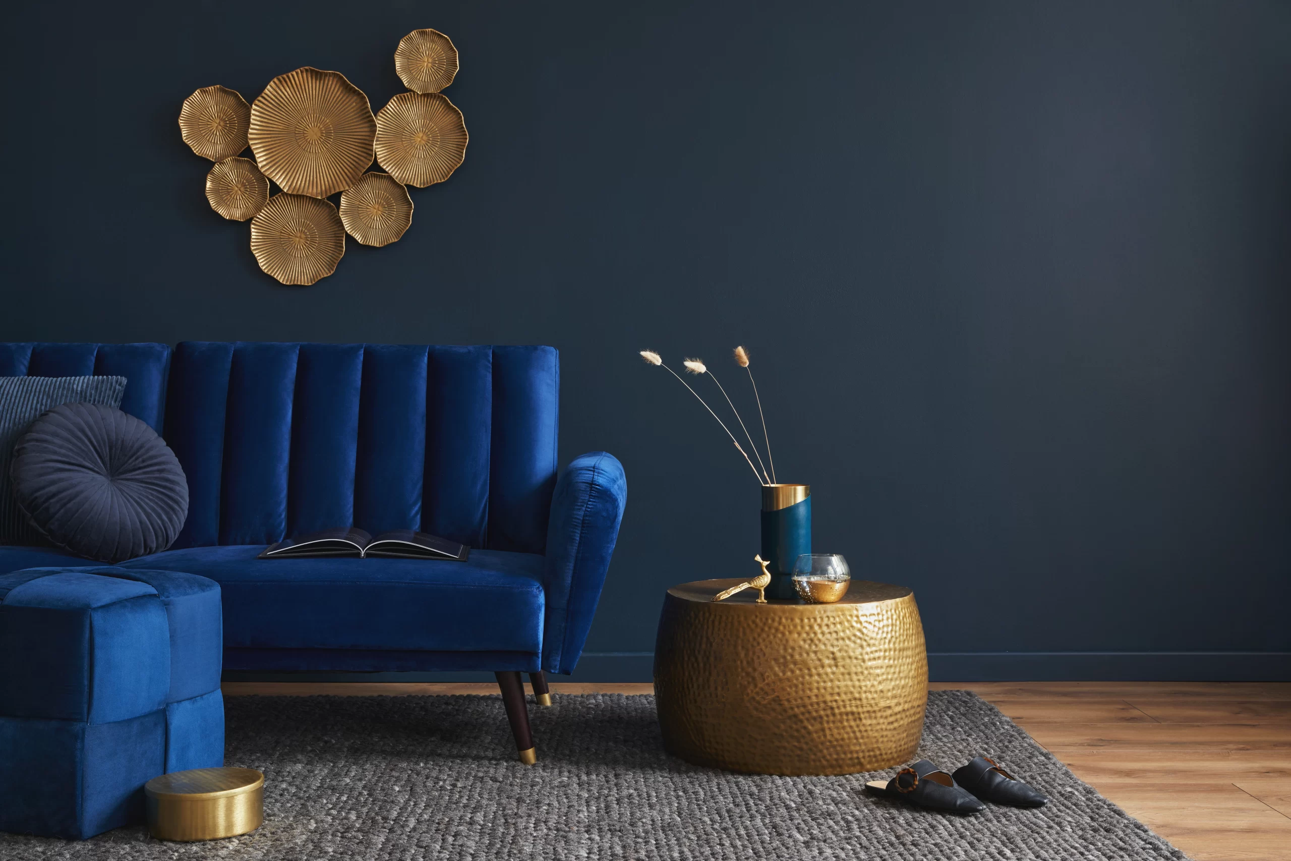
5. Navy Blue + Mustard Yellow + White
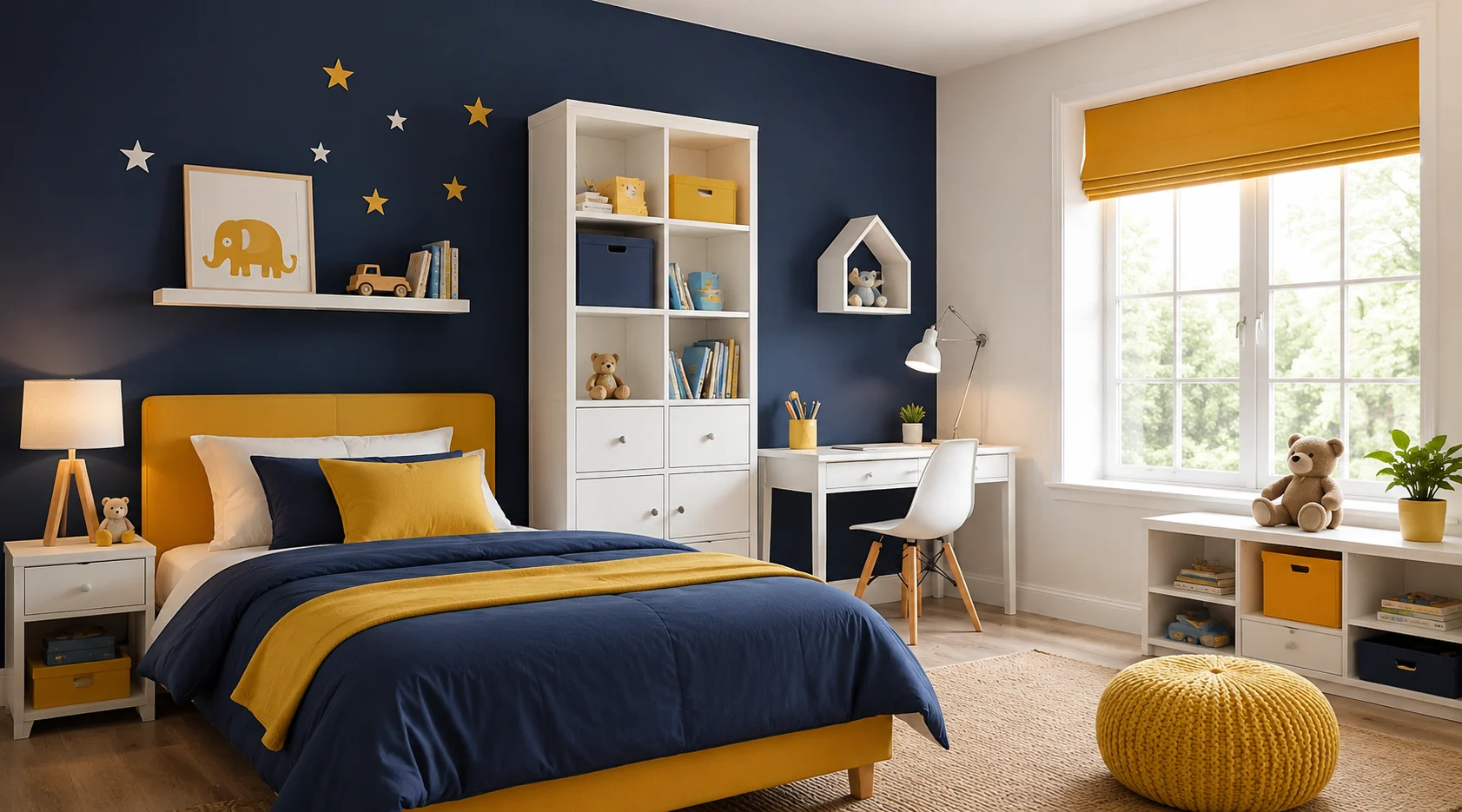
A bold, sophisticated palette that ages beautifully. Navy grounds the room with depth, mustard adds playful warmth, and white keeps the space from feeling too heavy.
- Best for: Older children (6-12), adventure-themed rooms, creative learners
- Mood created: Bold, confident, imaginative
- Designer tip: Use navy on the lower half of the wall (dado rail style) with white above, and add mustard through bedding and accessories.
6. Lavender + Mint Green + White
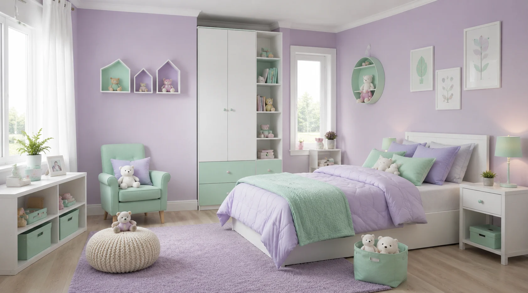
This soft, dreamy combination encourages relaxation and gentle creativity. Both lavender and mint carry cool undertones that feel modern and soothing without being clinical.
- Best for: Girls’ rooms, sensitive children, sleep-priority bedrooms
- Mood created: Dreamy, creative, calming
- Designer tip: Add rose-gold metallic accents on lamp bases or drawer handles to elevate the palette.
7. Terracotta + Warm White + Rattan
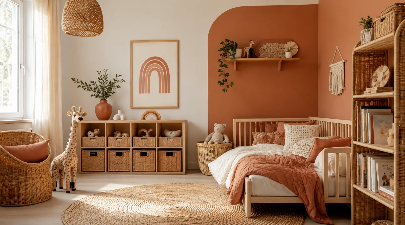
The earthy terracotta trend that dominated adult interiors has made its way into children’s rooms, and it works beautifully. It feels grounded, warm, and culturally rich.
- Best for: Boho-inspired rooms, creative children, gender-neutral spaces
- Mood created: Adventurous, warm, artistic
- Designer tip: Pair terracotta walls with cream linen, rattan furniture, and hand-painted wall murals for a storytelling environment.
Colour Combinations by Age Group
| Age Group | Suggested Colour Palette | Colours to Avoid |
| 0–2 Years (Infants & Toddlers) | Gentle pastels, soft yellow, warm white, light blue tones | Dark shades and bold, high-contrast wall designs |
| 3–6 Years (Preschoolers) | Cheerful accent colours like coral, sunshine yellow, sage green, and bright primary hues | Excessive use of red and overly vibrant colour schemes that may feel overwhelming |
| 7–12 Years (School-Age Children) | More sophisticated shades such as navy blue, terracotta, forest green, and mustard | Very soft baby-themed pastels that may not suit their growing personality and interests |
The 60-30-10 Rule for Children's Room Colours
Interior designers consistently apply the 60-30-10 colour rule to create balanced, visually pleasing spaces. Here is how to apply it to a child’s room:
- 60% – Dominant Colour: Walls and large surfaces. Choose a calm, neutral base like soft white, cream, or light sage green.
- 30% – Secondary Colour: Furniture, curtains, and large textiles. This is where personality comes in. Choose a colour your child loves.
- 10% – Accent Colour: Cushions, artwork, lampshades, and small accessories. This is the pop of excitement that makes the room feel curated.
Example: 60% white walls + 30% navy bedding and wardrobe + 10% mustard yellow in cushions and accessories.
Key Takeaways
- Warm colours (yellow, orange, red) energise and stimulate creative thinking.
- Cool colours (blue, green, lavender) promote calm, focus, and restful sleep.
- Neutral bases (white, cream, greige) provide flexibility as children grow.
- The 60-30-10 colour rule works perfectly for children’s room design.
- Avoid overly saturated walls; opt for muted, nature-inspired tones for longevity.
- Accent colours via furniture, rugs, and art are easier to update as preferences change.
FAQs
Yellow, coral, and soft lavender are among the best colours for encouraging creativity because they stimulate imagination while maintaining a positive and comfortable environment.
Avoid overly bright reds, neon shades, and heavily saturated colours on large surfaces, as they can feel overstimulating.
Soft blue and sage green are among the most calming colours, helping create a relaxed environment for sleep and study.
Pastels work better for larger wall areas, while bright colours are best used as accents to add energy without overwhelming the space.
Use a neutral base, such as white or cream, and add accent colours through furniture, bedding, and decor.
Stick to three main colours using the 60-30-10 rule to keep the room visually balanced and easy to update over time.